KOKUYO CI コクヨ
コクヨ株式会社は、1905年10月の創業から120周年を迎えたことを機に、リブランディングを実施。コクヨ初のコーポレートメッセージとして「好奇心を人生に」を設定し、ロゴを含むコーポレートアイデンティティも刷新しました。
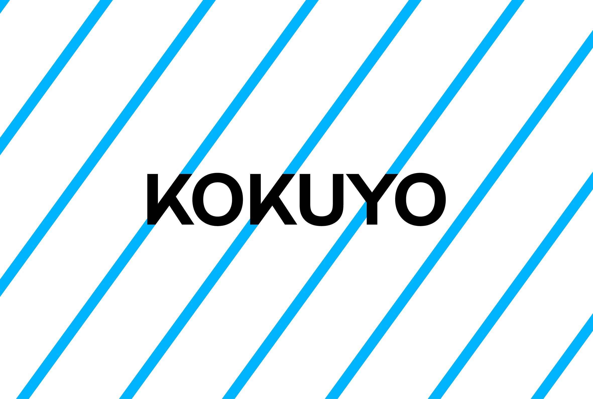
新しいロゴのデザインには、好奇心あふれる未来に向けたコクヨのありたい姿と目指す想いが込められています。K、K、Yの3文字が、等間隔の斜めラインで並び揃っており、この斜めラインはコクヨの歴史と未来を繋ぐように無限に連なり、どこまでも伸びていきます。さらに、このロゴは並べ方と組み合わせ方によって、様々なパターンで展開していくことができ、世の中と多面的に繋がるコクヨならではの事業の広がりと、強くしなやかな可能性を表現しています。
KOKUYO Co., Ltd. underwent a rebranding to mark the 120th anniversary since its founding in October 1905. With "Curiosity is Life" set as KOKUYO's first corporate message, the corporate identity, including the logo, has also been renewed.
The new logo design embodies KOKUYO's vision and aspirations toward a future filled with curiosity. The three letters K, K, and Y are aligned along evenly spaced diagonal lines that extend infinitely, as if connecting KOKUYO's history with its future. The logo can also unfold into various patterns through different arrangements and combinations. It expresses the breadth of KOKUYO's distinctive business, which connects with the world in multifaceted ways, and the strong yet flexible possibilities the company holds.
Year: 2025-
Creative Direction: Tetsuro Yasunaga (YOHAK DESIGN STUDIO)
Art Direction / Design: Taku sasaki, Aki Kanai (YOHAK DESIGN STUDIO)
Design: Yuwa Hozaki, Leo Arimoto (YOHAK DESIGN STUDIO)
Project Management: Chiho Shimizu, Go Hoshi, Mai Esaki (KOKUYO)
Motion Design: Kota Iguchi (CEKAI)
Sound: Takuya Kuroda
Photo: Junpei Kato, KOKUYO
Supervisor: Shogo Kishino (6D)