n.5_VI
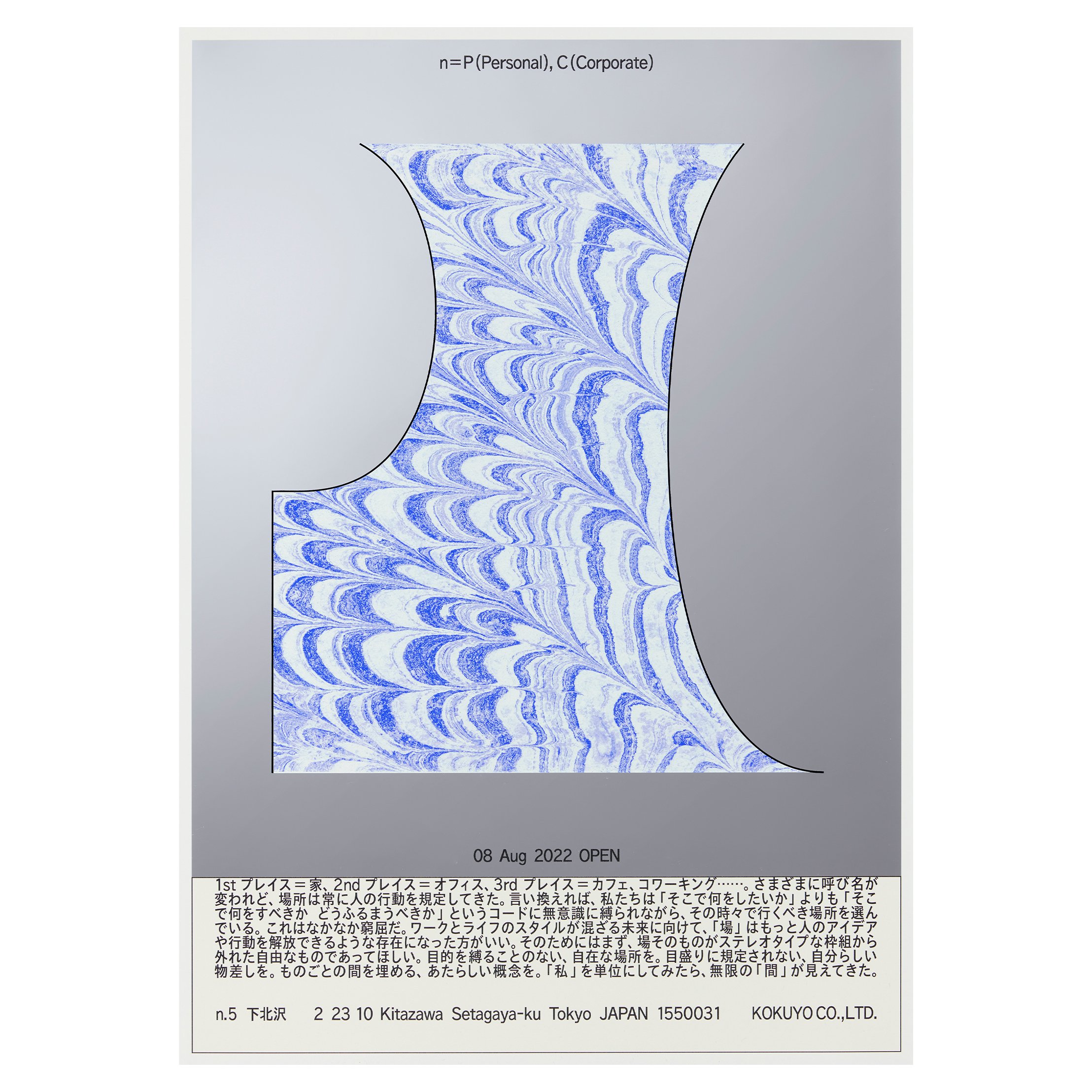
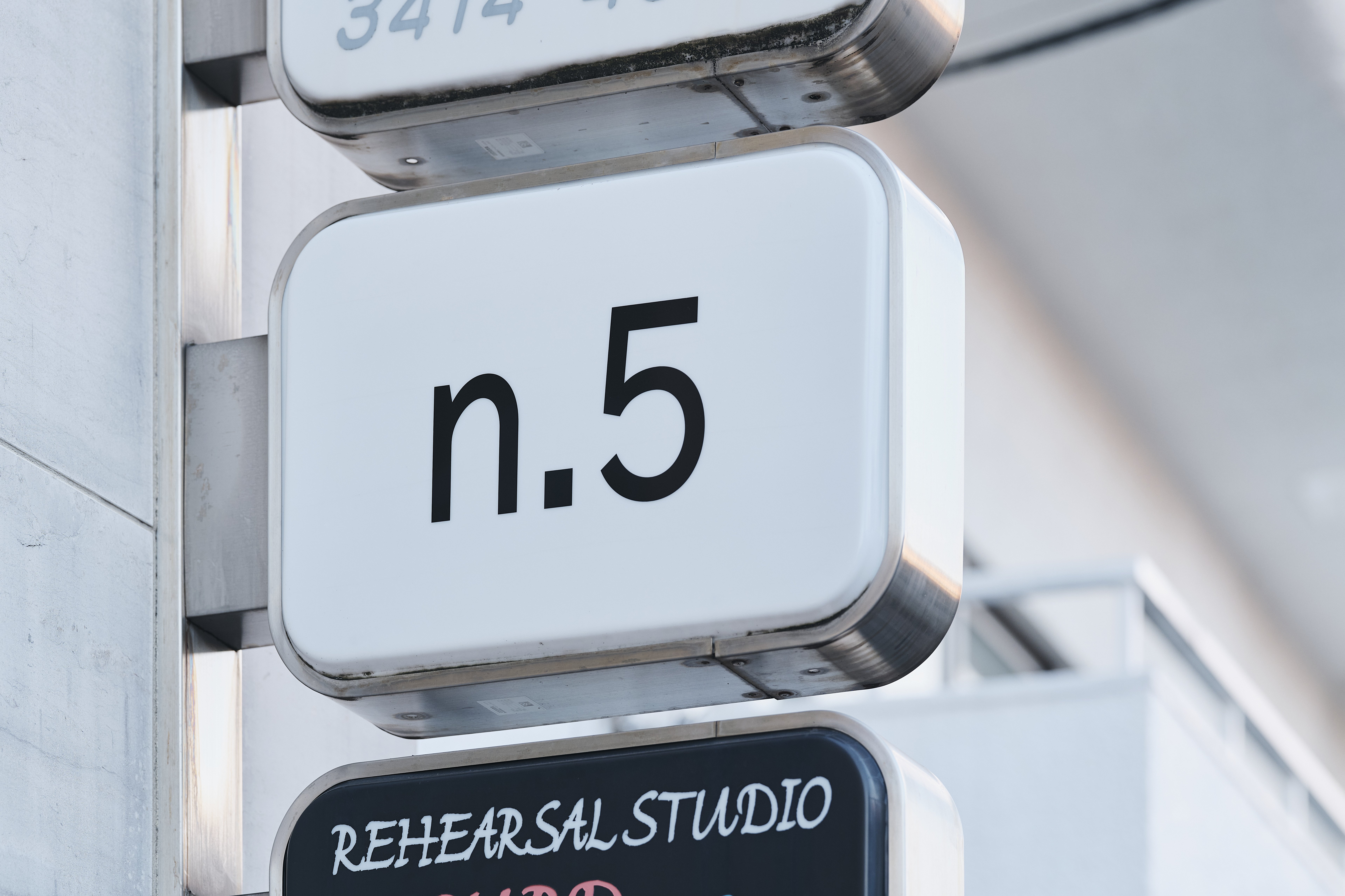
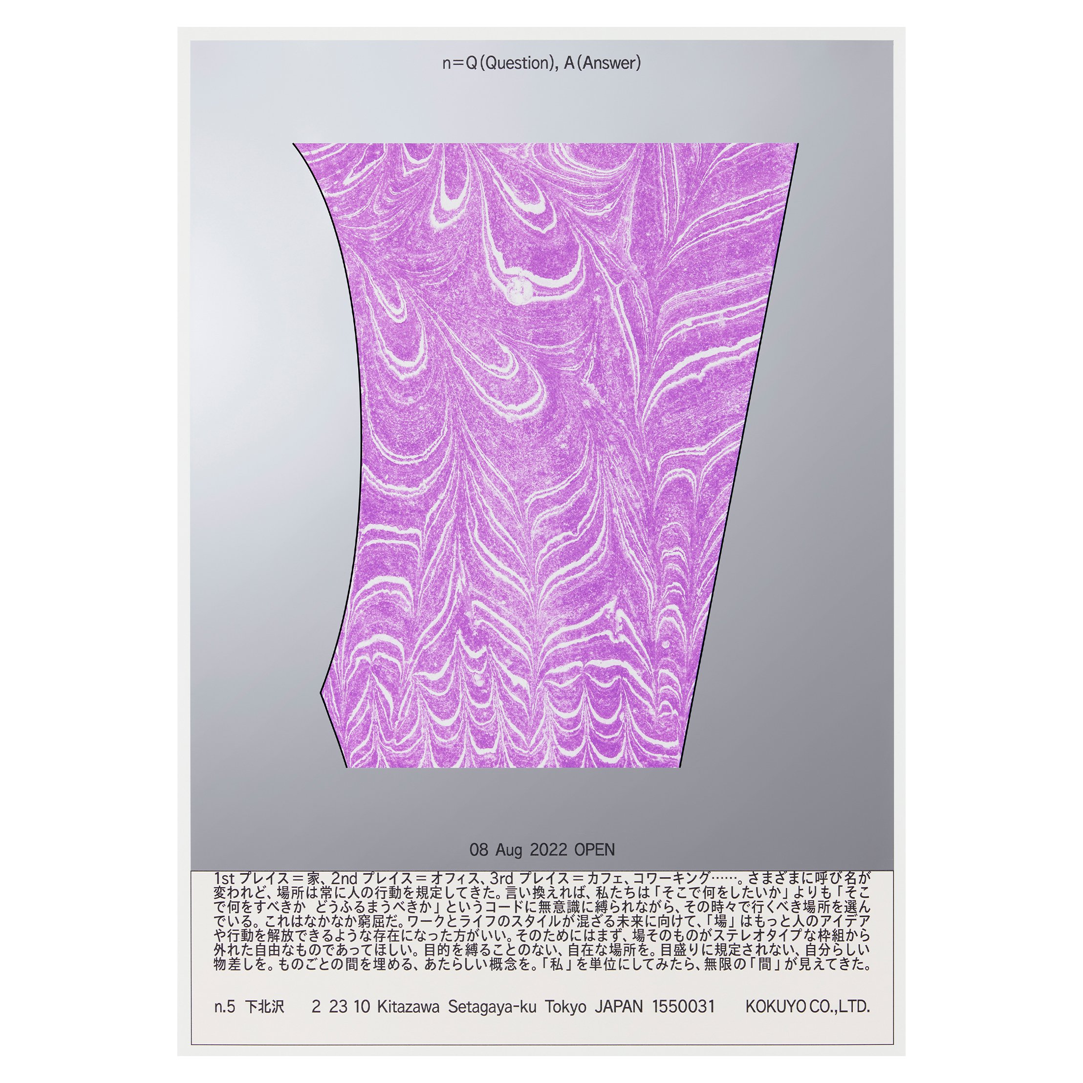
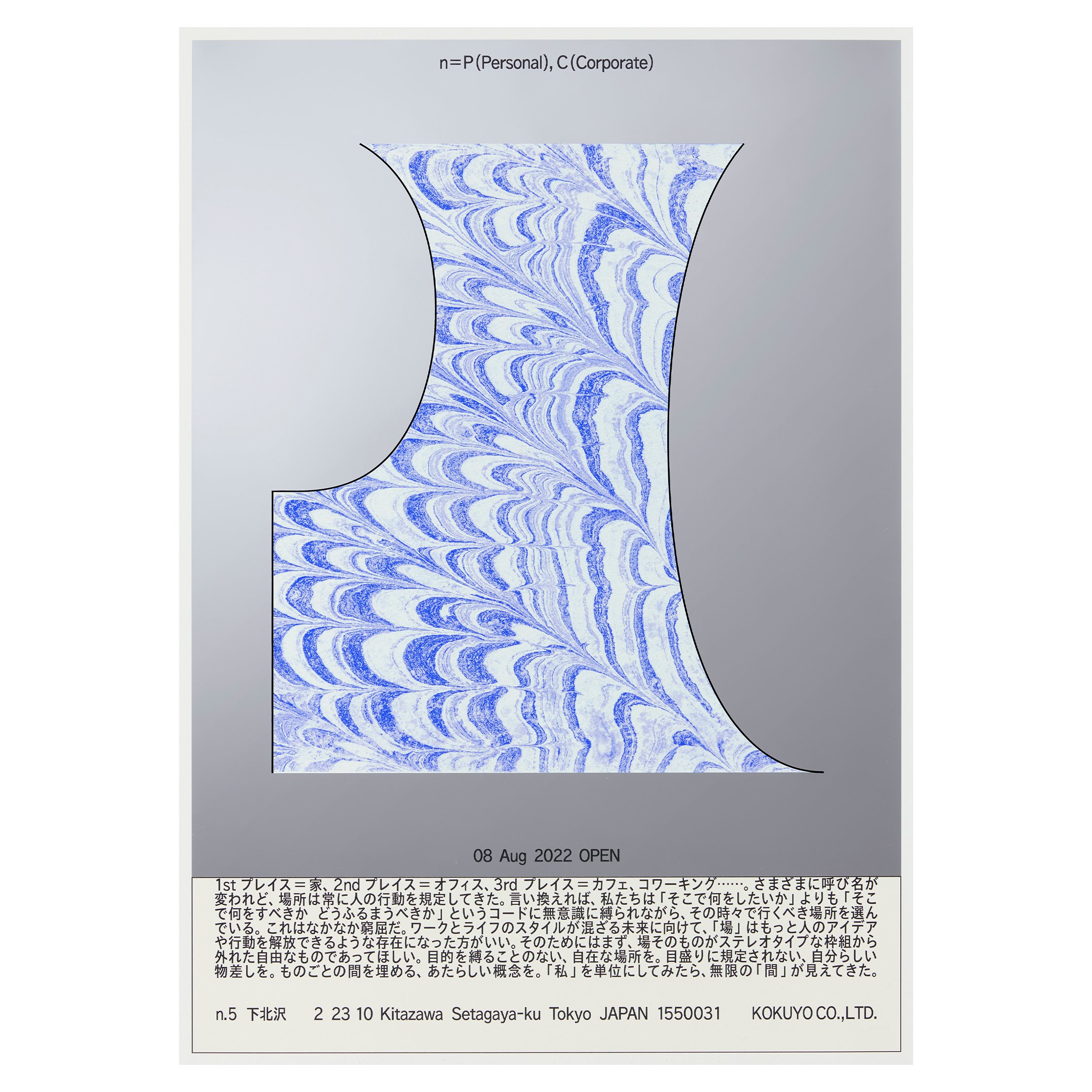
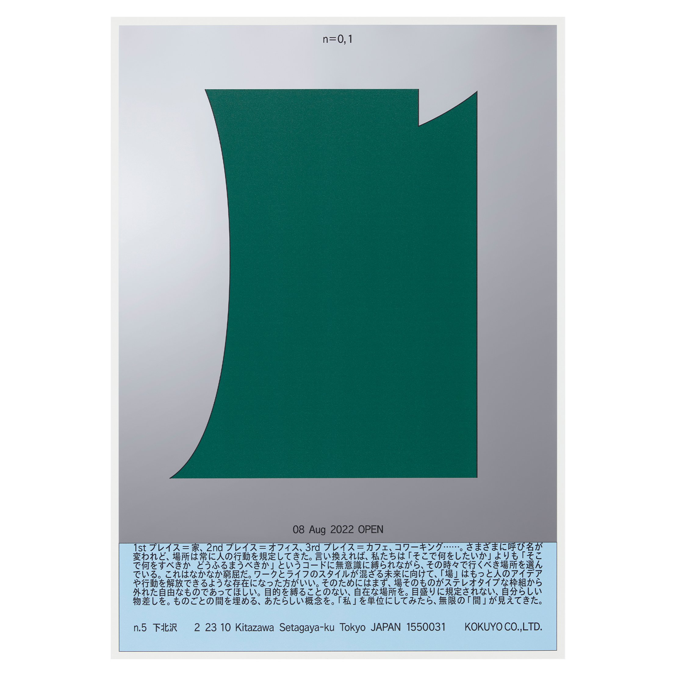
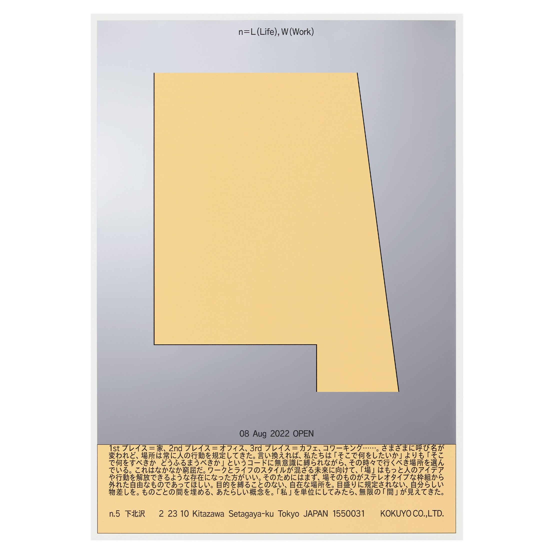
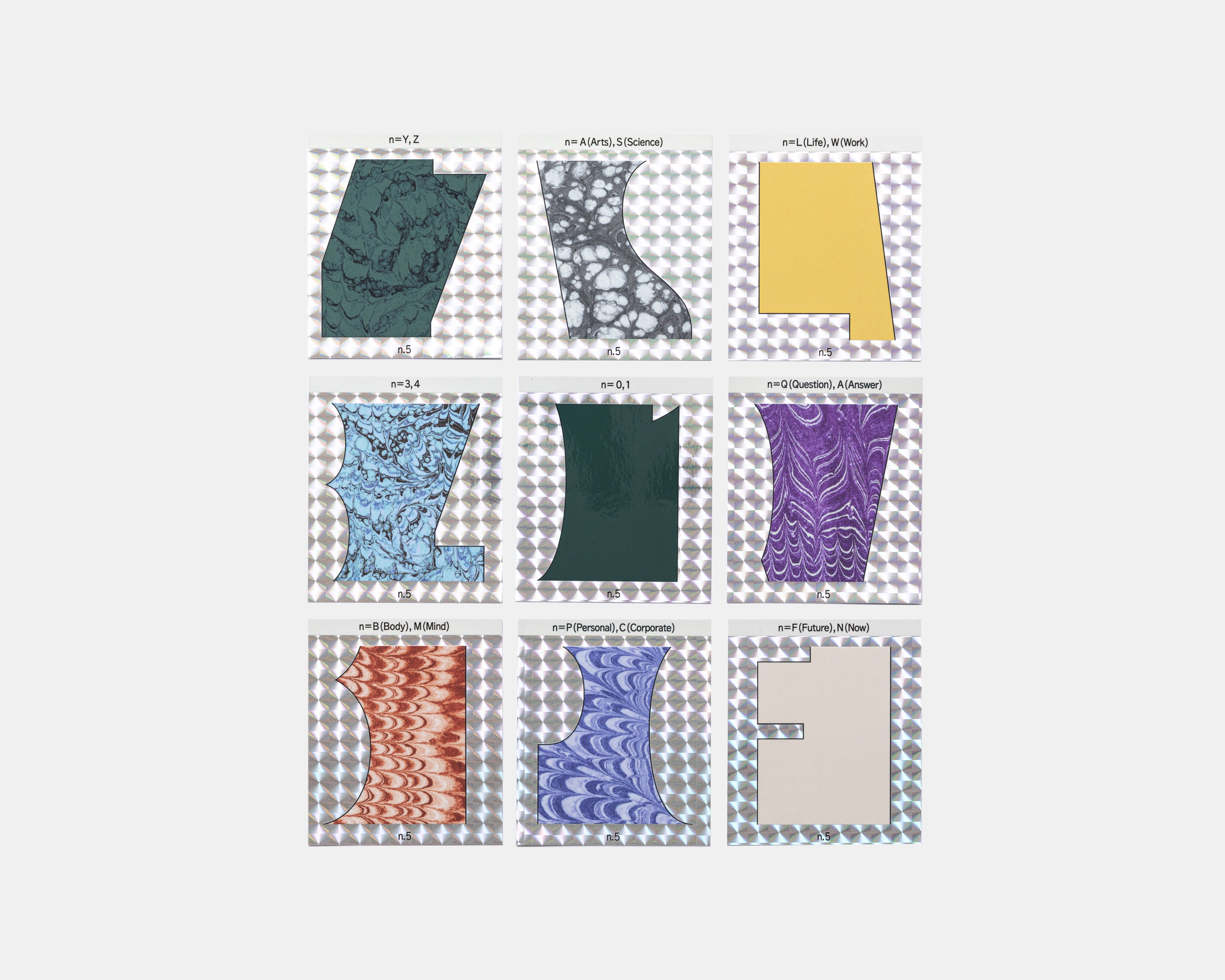
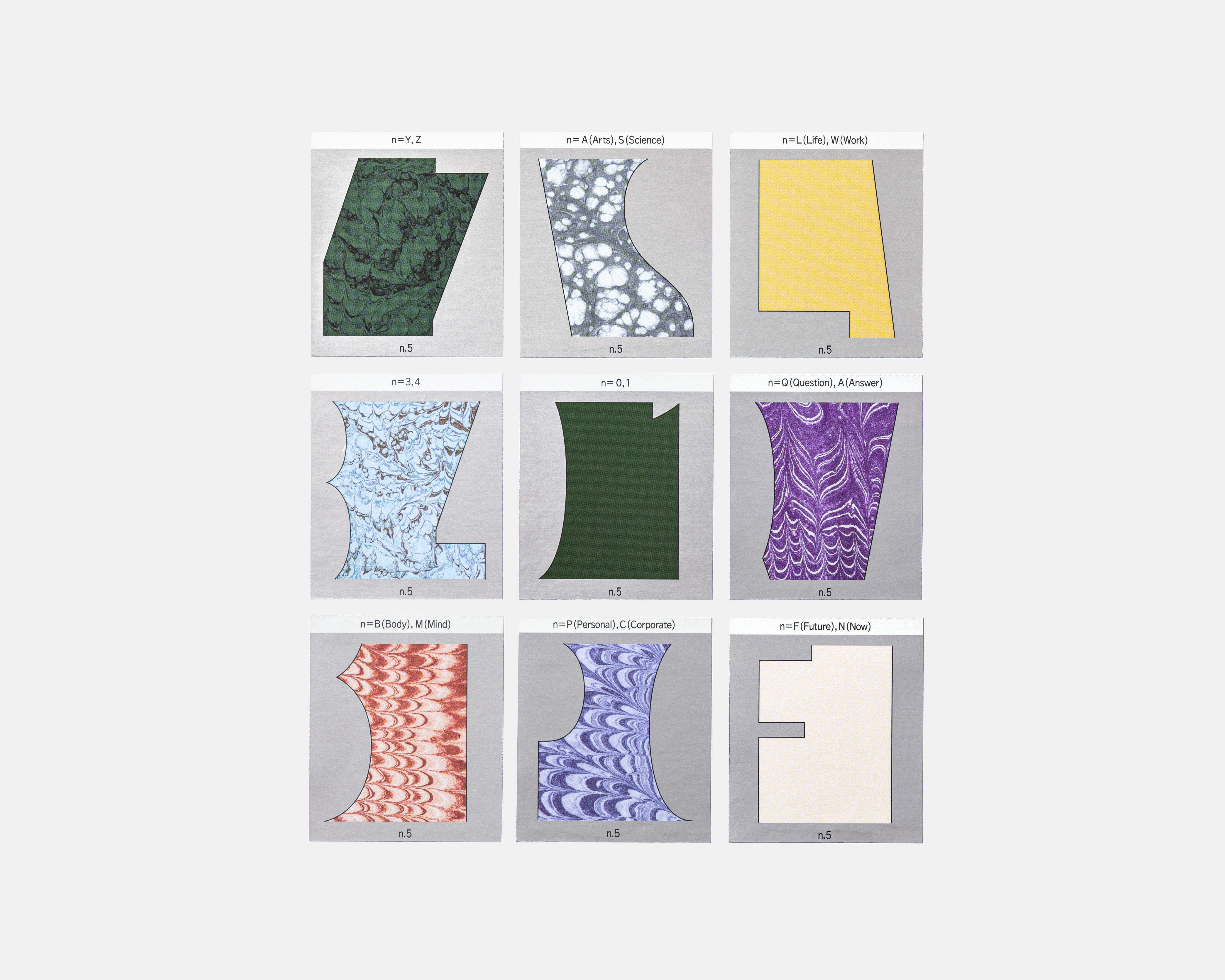
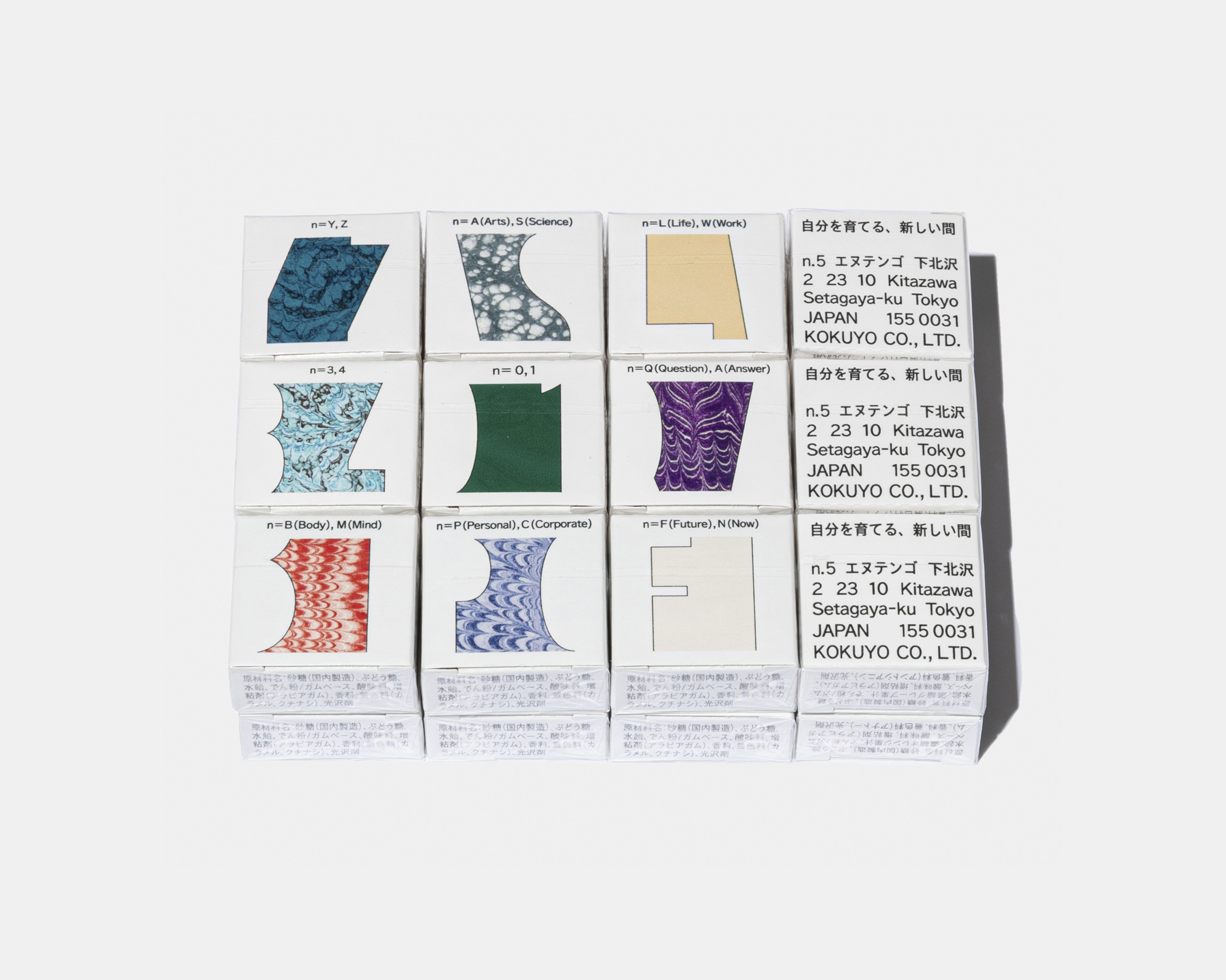
コクヨのサテライト型多目的スペース「n.5 下北沢」のビジュアルアイデンティティ。ものごとの「間」に存在する多様な価値観や無限に広がる可能性の象徴として、インクが混ざり合ったマーブル模様をデザインに取り入れています。このマーブル模様は、コクヨが1913年から製造していた洋式帳簿の小口部分で使用されていたもので、製造時に職人が一点一点作られていたものを使用。アーカイブと現在の混ざり合いによって新たなビジュアルを制作しました。
文字記号の「間」をはじめ、LifeとWork、PersonalとCorporateなど、施設の考え方をあらわす単語の頭文字の「間」を切り取り、線を用いて浮き彫りにすることで、ものごとの「間」に存在する多様な選択肢や無限に広がる可能性の象徴をテーマにしています。
Visual identity for KOKUYO’s satellite-style multipurpose space, “n.5 Shimokitazawa.” The design incorporates a marbled pattern of mixed inks as a symbol of the diverse values and infinite possibilities that exist in the “in-between spaces” of things. This marbled pattern originates from the edges of Western-style ledgers that KOKUYO has been manufacturing since 1913, each of which was made by artisans. By blending archival elements with the present, a new visual has been created.
The design theme symbolizes the various options and infinite possibilities that exist in the “in-between spaces” by extracting the spaces of the initial letters of words or symbols representing the facility’s concept, as well as emphasizing the gaps between Life and Work, Personal and Corporate, using lines.
Year: 2022
Location: Tokyo
Art direction / Design: Aki Kanai, Taku Sasaki (YOHAK DESIGN STUDIO)
Producer: Gou Hoshi (KOKUYO Co.,Ltd.)
Coordinator: Chihiro Kinoshita
Client: KOKUYO Co.,Ltd.