THE CAMPUS_VI
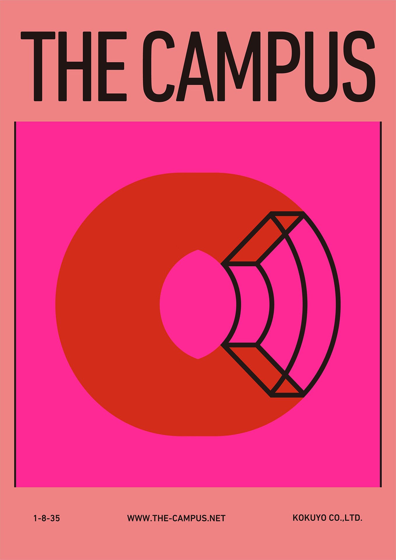
コクヨが運営する「働く・暮らす」がテーマの実験場「THE CAMPUS」のビジュアルアイデンティティ。「みんなのワーク&ライフ開放区」をコンセプトに、施設名の頭文字「C」を立体化してビジュアルを展開し、空間や場の拡がりを示す変化する図形は、多様なアクティビティを表しています。 また中性的に表現したピンクは、多様性を表すとともに、色本来の柔和で温かいイメージによって、企業として人や街に寄り添う気持ちも表現しています。そしてオフィスや街で見慣れない特徴から、新しいことの始まりを想起させるカラーとしての役割を果たしています。
Visual identity for “THE CAMPUS,” an experimental space operated by KOKUYO based on the themes of “working and living.” With the concept of an “open zone for everyone’s work and life,” the design features a three-dimensional representation of the letter “C” from the facility name. The shifting geometric shapes represent expanding spaces and diverse activities. The neutral-toned pink not only represents diversity, but also conveys the color’s inherent softness and warmth, reflecting the company’s commitment to people and communities. Its distinct feature in office and urban settings also plays a role in evoking the feeling of new beginnings.
Year: 2021
https://the-campus.net/
Art director / Design: Aki Kanai, Taku Sasaki (YOHAK DESIGN STUDIO)
Design: Serina Shiota (Serina Shiota Design Office)
Motion Design: Kota Iguchi (CEKAI)
Web Design: Ryoji Tanaka, Seiji Arimoto (Semitransparent Design)
Photograph: Gottingham, Keita Yamamoto
Planning: Tetsuro Yasunaga, Hisashi Kano (YOHAK DESIGN STUDIO) / Mai Esaki, Koji Aoki (KOKUYO Co.,Ltd.)
Project Management: Go Morita (KOKUYO Co.,Ltd.)
Client: KOKUYO Co.,Ltd.