@COSME TOKYO
ビューティーテーマパーク をコンセプトに、多様なブランドや商品との出会いを楽しみながら散策するような店舗計画を目指しました。コスメブランドが集結するショップでは、専用什器が縦横無尽に配置されるため、それらを包括するようなテーマパークとしてのアイデンティティが必要だと考えました。
ブランドのVIとして「dot & space」が新たに発表されたタイミングであったため、多様なマテリアルやサイズで dot & space を制作し、店舗のあらゆる場面に展開。dot & spaceが拡張されていくような空間を目指しました。
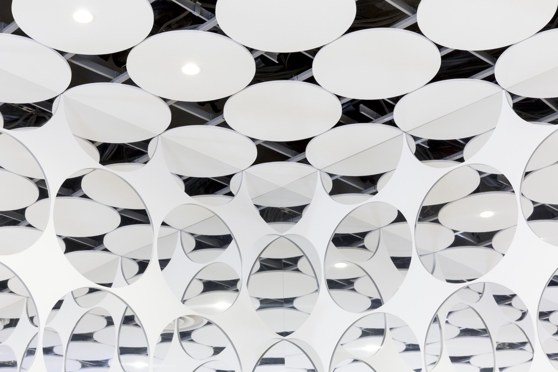
また、店舗内には高さのあるブランド什器が並ぶため、路面からの視線も意識し、天井をアイコニックなデザインにすることを検討。空調のアネモのサイズで dot をつくり、さらに壁にミラーを施すことで、天井が奥まで連続していくような視覚効果を生み出しています。
Based on the concept of a beauty theme park, the store plan aimed to create a store where customers could stroll around and enjoy encounters with a variety of brands and products. As dedicated fixtures are arranged in every direction in a store where cosmetic brands are gathered, there was a need to unify these fixtures and have the strength to establish an identity as a theme park.
As it was the time when “dot & space” was newly announced as the brand’s VI (visual identity), dot & space was created in a variety of materials and sizes, and deployed in all aspects of the store. The aim was to create a space where “dot & space” would be expanded.
In addition, because the store is lined with tall brand fixtures, visual cues from outside the store were also taken into consideration, and consideration was given to creating an iconic ceiling design. By creating a dot the size of an anemo in the air conditioning and then mirroring the walls, a visual effect was created in which the ceiling seems to be continuous all the way to the back.
YEAR : 2020
LOCATION : Tokyo, Harajuku
Client: istyle Inc.
Design: Hisashi Kano (YOHAK DESIGN STUDIO)
Sign Planning: Taku Sasaki (YOHAK DESIGN STUDIO)
Photograph: Keita Yamamoto / Taku Sasaki (YOHAK DESIGN STUDIO)